The willow tree and the family tree merged into a single contemporary symbol, carrying heritage, structure, and multigenerational commitment without needing to explain any of it. The restraint in the design reflects the restraint in the firm.
Willow Street Group
Reputation OUtgrew the Brand
For firms that manage multigenerational wealth, the brand isn’t separate from the service. It’s the first test of whether a family’s advisors will even make the introduction. Willow Street Group had grown from a regional fiduciary to one serving multinational families, but the identity still belonged to the smaller firm.


Discovery drove every creative decision.
Stakeholder interviews surfaced the competitive values and operational principles that separated Willow Street from larger, more institutional competitors. Those findings drove every decision from mark-making to messaging tone.
Stakeholder discovery <i>shaped the identity</i>, not design trends.
STRATEGY BEFORE DESIGN
Two ideas became one mark.
Built for families, not the financial industry.
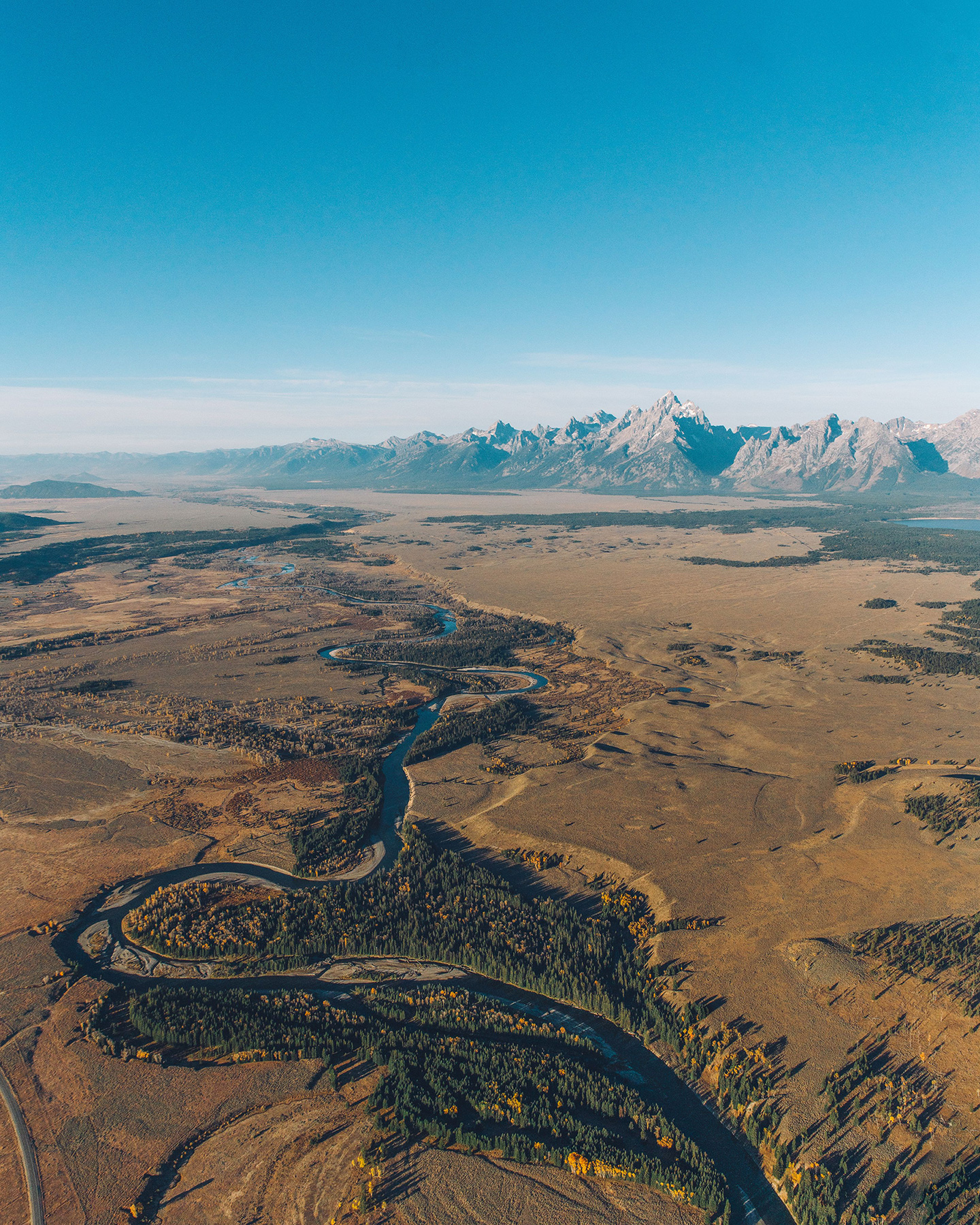
Complex trust and fiduciary language was restructured into clean, intuitive layouts built around how families actually explore these services. Original photography of Grand Teton landscapes and fine art replaced stock imagery, positioning Willow Street as a Wyoming institution with national authority.
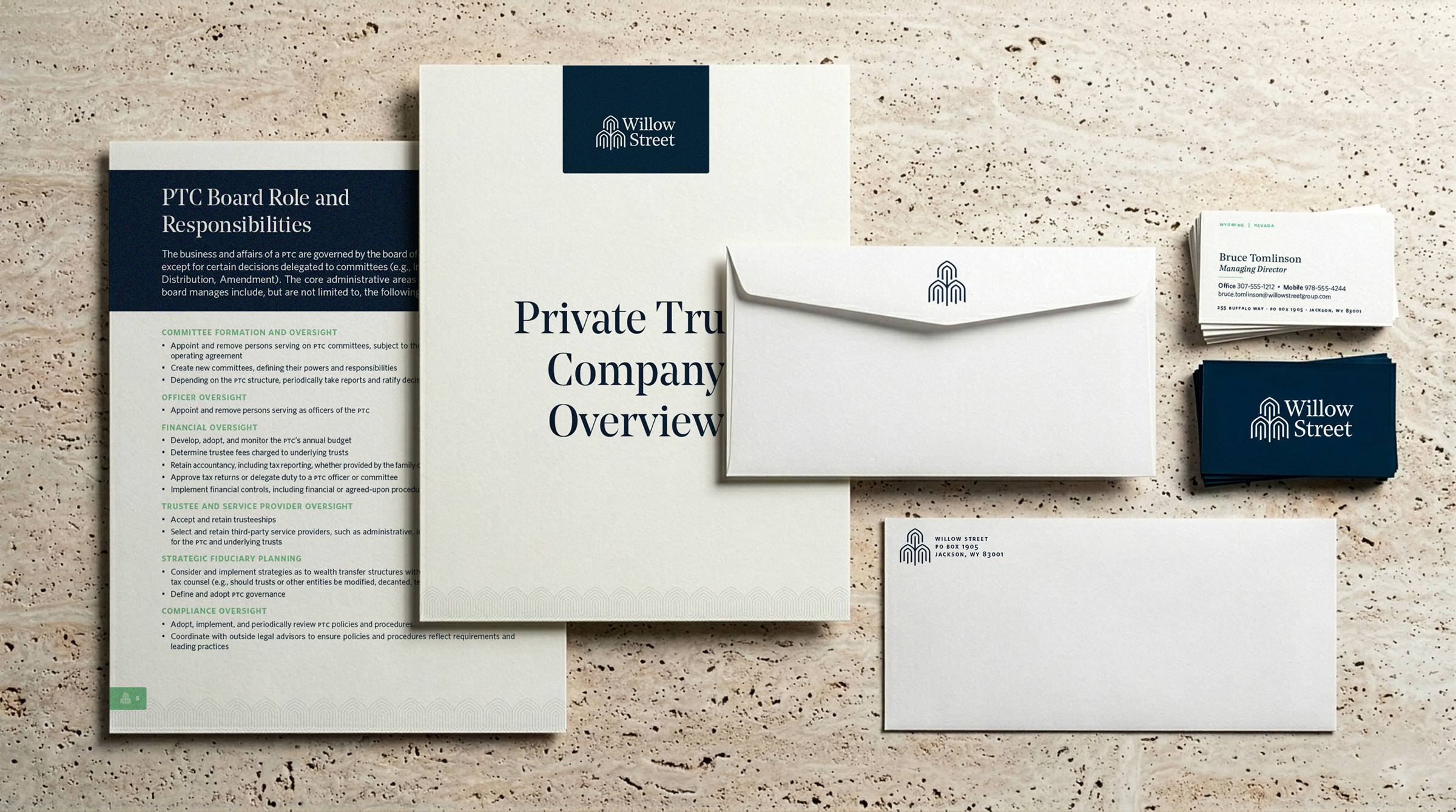
A brand system, not just a new logo.
Comprehensive guidelines documented color, typography, logo usage, photography direction, and tone of voice, giving the team a system they could execute consistently without outside help on every decision.
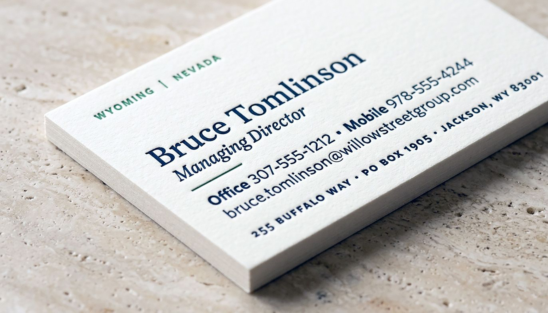
The advisors who make referrals notice brand quality before the families do.

The identity extended into the physical environment.
Freestanding and building-mounted signage at the Jackson Hole headquarters now carries the same brand presence clients experience online. Print collateral, stationery, and informational materials were rebuilt as a single unified system.
Every client touchpoint now communicates what the work always has.

More
Projects
The Clear Creek Group
Turning a home into a destination.